

Shopping Bag Printing That Builds Brand Recall
Shopping bag Printing turns every purchase into brand exposure. Choose materials, sizes, finishes, and artwork that fit your product, budget, and customers.
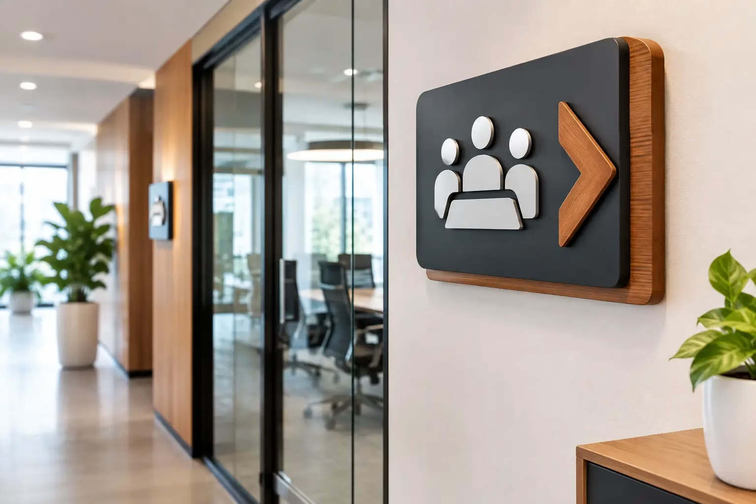
A visitor should be able to find reception, meeting rooms, departments, and elevators without stopping three people for directions. That is where 3D Office Sign Boards earn their place. More than decoration, dimensional signage gives an office a clear hierarchy, supports a professional first impression, and keeps brand colors and messages visible long after a brochure has been put away.
For a new office fit-out, a renovation, or a growing team moving into a larger space, the right sign system turns blank walls and doors into useful brand touchpoints. The best result is not always the largest or most expensive sign. It is the one that suits the viewing distance, interior finishes, lighting, traffic flow, and daily use of the space.
Flat printed signs have a role, especially for changing information, temporary notices, and large wayfinding maps. But a 3D sign creates depth through raised letters, logos, layers, or illuminated elements. That depth catches natural and artificial light, making the sign easier to notice from different angles.
At reception, a dimensional logo behind the desk establishes confidence before a guest speaks to anyone. Along corridors, raised room names and directional signs help people move with less confusion. In client-facing areas, the same approach carries a brand consistently from the front entrance to the boardroom.
This matters in offices shared by multiple tenants, medical clinics, schools, corporate headquarters, real estate sales centers, and hospitality workplaces. Clear signs reduce friction for visitors while helping employees feel that the workplace is organized and established.
Material selection affects appearance, cost, cleaning requirements, and lifespan. An impressive design on the wrong material can look out of place within months, particularly in high-touch or sunlit areas.
Acrylic is one of the most practical choices for interior office signage. It can be cut into precise letters and logos, produced in many colors, and installed directly on a wall or mounted on a backing panel. Gloss acrylic gives a clean, modern appearance, while matte finishes are better where glare is a concern.
Layered acrylic signs are particularly effective for reception logos, department identifiers, and meeting-room markers. Combining a colored base with raised white, black, metallic, or clear acrylic creates a polished dimensional finish without making the sign overly heavy.
Stainless steel, aluminum, brass-look, and brushed metallic finishes suit executive offices, law firms, financial companies, premium retail spaces, and hospitality settings. Metal letters communicate permanence and work well against stone, wood, textured paint, and neutral wall finishes.
The trade-off is that metal can cost more than acrylic and may require careful handling during installation. Fingerprints can also show on highly polished finishes. Brushed or matte metal is often the more practical choice for busy reception areas.
PVC and foam letters are lightweight options for larger indoor logos and decorative walls. They can be painted, laminated, or paired with acrylic faces for added visual impact. For signs viewed from a distance, thicker letters often create stronger shadows and make the brand mark easier to read.
Built-up letters use formed returns to create greater depth. They are a strong option when a business wants a substantial, architectural look. They require accurate fabrication and professional mounting, but the finished result can become the visual focal point of a reception area.
Wood-effect panels, natural wood, textured laminates, and fabric-backed signs can soften modern interiors or support a more handcrafted brand personality. These materials work well for creative studios, wellness centers, cafés, and boutique offices. They need to be selected carefully in humid, heavily cleaned, or high-traffic environments, where acrylic or metal may be more durable.
A strong sign program begins with movement, not just a logo file. Walk through the office as a first-time visitor would. Where do they enter? What must they find first? Where do routes become unclear?
Start with the reception sign, then identify the decision points: elevators, corridors, intersections, departments, meeting rooms, washrooms, exits, and restricted areas. A consistent family of 3D office signs gives every one of these locations a shared visual language.
Room signs should remain readable at close range, while corridor and directional signs need to work from farther away. A sign can look elegant on a design proof yet fail in practice if the lettering is too thin, too small, or too low-contrast against the wall.
For accessibility, use clear wording, strong contrast, and sensible placement. Raised characters can support tactile wayfinding where required, though accessibility standards and local building requirements should be checked before production. Safety and exit signs also need to follow applicable regulations rather than being treated as purely decorative pieces.
A large reception wall does not automatically call for oversized letters. The best letter height depends on the width of the wall, the height of the desk, and how far visitors stand from the sign. Leaving enough empty wall space around a logo often makes it feel more premium than filling every available inch.
Contrast is equally important. Dark letters on a dark feature wall may photograph well under studio lighting but disappear in a real office. White, black, metallic, and brand-color options should be tested against the actual wall finish whenever possible. Samples can prevent expensive surprises.
LED-lit 3D letters are useful in low-light receptions, offices that receive evening visitors, and spaces where the logo needs to remain a focal point after business hours. Front-lit letters offer a bright, direct effect. Halo-lit letters cast a soft glow onto the wall behind them and tend to look refined in corporate interiors.
Lighting adds impact, but it also adds planning. Power access, cable concealment, wall construction, maintenance access, and operating hours should be considered before selecting illuminated signage. In a naturally bright office used only during daytime, non-illuminated acrylic or metal letters may offer better value.
Dimensional signs are not simply printed graphics with extra thickness. Fine strokes, tiny gaps, intricate gradients, and very small lettering may not translate well into cut or built-up materials. A production-ready artwork review should confirm that the logo can be fabricated cleanly at the intended size.
For best results, provide a vector logo file whenever available. This allows accurate cutting and scaling. If only a low-resolution image exists, it may need to be recreated before fabrication. Brand colors should also be matched against approved references, especially when the signs will sit beside printed stationery, wall graphics, or retail displays.
Mounting method matters too. Flush-mounted letters create a neat, close-to-wall look. Stand-off mounts add visible spacing and shadows, which can make panels and plaques easier to notice. Concealed fixings usually deliver a cleaner finish, while visible hardware can suit industrial or technical interiors.
Before production, confirm the wall type. Drywall, glass, concrete, wood cladding, marble, and textured surfaces all require different installation methods. A site measurement and installation check reduce the risk of crooked alignment, weak adhesion, or damage to finished walls.
A reception logo, door labels, directional signs, and safety markers should feel connected. Use the same typeface family, color rules, icon style, thickness, and mounting approach where possible. This does not mean every sign must look identical. Reception signage can be more prominent, while room markers can be simpler and more functional.
Think ahead to growth as well. If departments may expand or office layouts may change, choose a sign system that can be updated without replacing everything. Interchangeable nameplates, modular directory panels, and replaceable vinyl inserts can keep future costs under control.
For businesses managing a complete fit-out, working with one production partner for design checks, fabrication, site coordination, and installation can save time and avoid mismatched finishes. IWPrinting.com helps businesses coordinate custom office signage with wider branding needs, from wall graphics and window films to event displays and printed materials.
Confirm the sign locations, final measurements, wall materials, logo artwork, brand colors, and required delivery date before approving production. Decide which signs need illumination, which signs need to be changeable, and who will approve the final artwork. These details keep the project moving quickly and help prevent revisions after fabrication has started.
The most effective 3D office sign boards do not shout for attention at every turn. They guide people, reinforce the brand, and make the workplace feel ready for the people who walk through its doors.
Shopping bag Printing turns every purchase into brand exposure. Choose materials, sizes, finishes, and artwork that fit your product, budget, and customers.
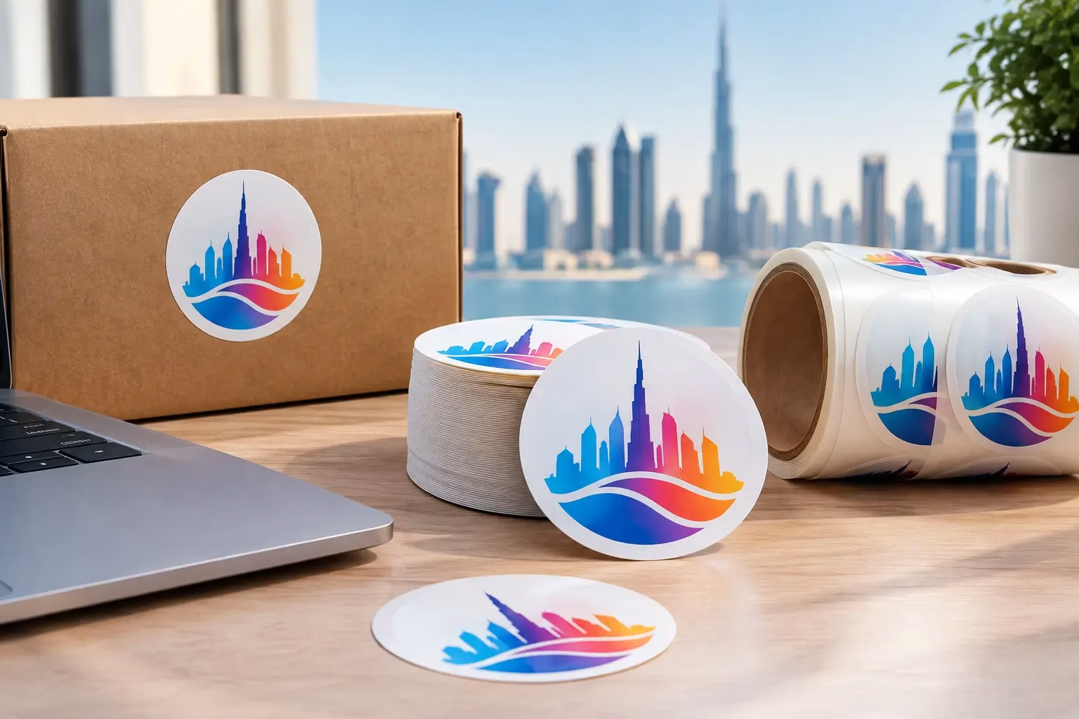
Get Round Sticker Printing in Dubai for product labels, events, and promotions. Choose durable materials, sharp color, custom sizes, and fast delivery.
WhatsApp us
Printing, corporate gifts and signage — tell us what you need and let AI help you find it.
Ask naturally. IWPrint AI can understand your product, quantity, budget and requirement.