A retail window has only a few seconds to earn attention from someone walking past. The right message can turn empty glass into a reason to enter, while a crowded or poorly installed design can make a store feel closed, confusing, or less premium. This retail window graphics guide explains how to plan graphics that look professional, support sales, and work with the way customers actually approach your storefront.
Start With the Job Your Window Must Do
Window graphics are not one product with one purpose. A boutique launching a seasonal collection needs a different approach than a pharmacy communicating operating hours, or a restaurant promoting delivery, offers, and menu highlights. Before choosing a material or approving artwork, identify the primary action you want people to take.
For most retailers, that action is one of three things: enter the store, notice a specific offer, or recognize the brand. Trying to do all three equally on every pane often creates visual noise. Give the main message the largest share of space, then support it with only the information needed to make the decision easy.
A fashion retailer may lead with a campaign image and a short sale message. A salon may prioritize services, booking details, and privacy. A new store can use the window to build anticipation before opening, then change the graphics to communicate its first offer once trading begins. The objective should guide every later decision, including size, material, color, and placement.
Choose the Right Retail Window Graphics Material
The material affects visibility, privacy, durability, removal, and cost. It also determines how much daylight reaches the interior. The lowest-priced option is not always the best value if it fades quickly, leaves adhesive residue, or prevents customers from seeing attractive products inside.
Clear Vinyl for a Lighter Branded Look
Clear vinyl is useful when you want branding, product images, or promotion details without covering the entire window. It works well for logos, opening hours, small decals, and designs that need a transparent background. Because the glass remains visible, clear vinyl helps maintain an open storefront feel.
This option needs careful artwork preparation. White ink may be required behind light colors, otherwise some printed areas can appear less visible against changing light conditions inside and outside the store.
Frosted Film for Privacy and Premium Branding
Frosted window film gives glass a clean etched appearance while allowing light through. It is a practical choice for salons, clinics, offices within retail spaces, changing areas, and storefronts where privacy matters. Cut frosted graphics can display a logo or pattern without making the entrance feel blocked.
Frosted film is less suitable for highly detailed promotional messages. It is strongest when the design is simple, consistent, and intended to stay in place for a longer period.
One-Way Vision Film for Coverage With Visibility Out
One-way vision film has small perforations that let people inside see outward while displaying a printed image to people outside. It can cover large areas, reduce direct sun glare, and create a bold campaign surface. It is popular for stores in high-footfall locations where the glass needs to work harder as advertising space.
There is a trade-off. The view from inside is reduced, especially in lower light, and the graphic can look less sharp up close than solid vinyl. Keep text large, avoid fine details, and consider how internal lighting will affect the appearance at night.
Solid Vinyl for High-Impact Promotions
Opaque self-adhesive vinyl delivers strong color and clear messaging. It is a dependable choice for sale graphics, large product visuals, temporary launches, and windows that do not need to remain transparent. It can also conceal an unfinished interior during fit-out work.
For frequent campaigns, removable vinyl is usually more practical than a permanent adhesive. It costs more than paper posters in some cases, but it looks more professional and handles window exposure far better.
Design for the Street, Not the Screen
A design approved on a laptop can fail completely from the sidewalk. Retail window graphics must be readable at the distance and speed at which people see them. A customer walking past has less time than someone standing in front of a mall directory, so clarity matters more than adding every available detail.
Use one strong headline, a visible call to action, and a limited amount of supporting text. If a promotion includes a price, discount, date, or product category, make those details easy to scan. Fine print belongs only where it is legally necessary, not as the centerpiece of the design.
Color contrast is equally important. White lettering may disappear against a bright store interior. Dark colors can lose impact on shaded glass. A qualified print partner can recommend white underprinting, contour-cut lettering, or a solid color panel where needed to improve legibility.
Brand consistency should still be visible. Use approved logo spacing, familiar colors, and the same tone customers see on packaging, social media, signage, and in-store displays. The window is often the first physical brand touchpoint, so it should not feel disconnected from the experience inside.
Plan the Layout Around Doors, Displays, and Sightlines
Glass is not a blank rectangle. Door handles, mullions, security stickers, display fixtures, shelving, and lighting all affect where graphics should sit. Measure every pane individually and take photos from across the walkway before finalizing the layout.
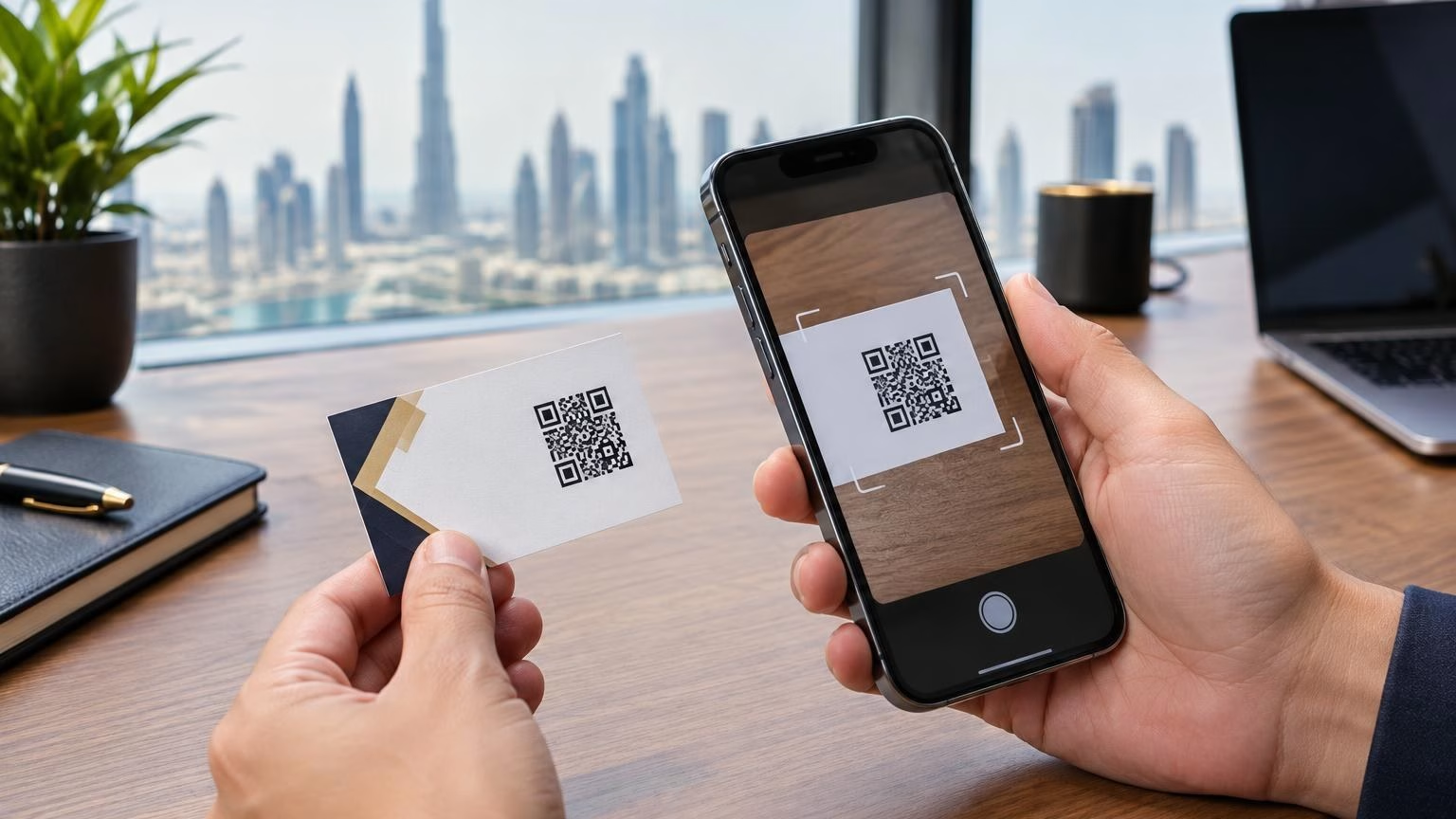
Place essential information at a natural viewing height. Opening hours, QR codes, contact details, and short promotional messages should not sit too low near the floor or too high above eye level. Keep safety markings and required access visibility clear around entrances.
Avoid covering your best in-store display unless privacy is the goal. If the store has an attractive product wall, seasonal feature, or welcoming interior, frame it with graphics rather than hiding it. Conversely, if inventory, back-of-house activity, or fit-out work creates visual clutter, full coverage can make the storefront look more controlled.
For storefronts in sunny locations, also consider where glare falls during peak trading hours. A visual that looks excellent in the morning may be hard to read in direct afternoon sun. Material samples and a site review can prevent expensive reprints.
Build a Campaign Schedule Instead of Printing Once
Retail windows perform best when they are managed like active marketing space. Permanent elements such as the logo, operating hours, and core brand pattern can remain in place, while promotional sections change with launches, holidays, clearance periods, and events.
A practical schedule may include a major seasonal campaign, shorter monthly offers, and quick-turnaround messages for limited stock or local events. This approach keeps the storefront current without requiring a complete redesign every time.
Before production, confirm these points:
- The campaign start and end dates, including enough time for installation
- Final pane measurements, door clearances, and any landlord requirements
- Whether each graphic is permanent, removable, or intended for reuse
- The artwork files, brand colors, readable text sizes, and approval contact
- Access requirements for installation, including opening hours and cleaning time
For multi-location retailers, use the same master artwork while allowing store-specific details such as dates, phone numbers, or branch offers. This protects consistency while keeping local campaigns relevant.
Installation Is Part of the Finished Product
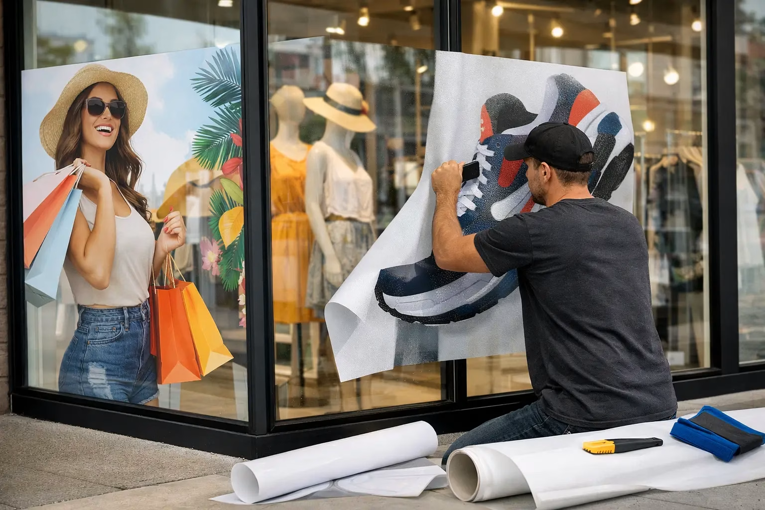
A well-printed graphic can still look poor if it is installed on dusty glass, stretched around frames, or applied with bubbles and misaligned edges. Professional installation is especially valuable for large panes, perforated film, frosted designs, layered applications, and graphics placed high above ground level.
The glass should be cleaned thoroughly and allowed to dry before application. Installers also need to assess weather, glass condition, and access. Exterior applications may need different materials and techniques than graphics mounted on the inside of the glass facing outward.
Do not treat removal as an afterthought. Seasonal graphics should come down cleanly and on schedule. Old, faded promotions send the wrong message and can make a store look neglected. Keep records of installation dates and material types so replacements and reorders are simple.
Balance Budget With Expected Life
The right budget depends on how long the graphic will stay up, how much glass is being covered, and whether installation is required. A short weekend promotion does not need the same material specification as a storefront identity designed to remain for years.
Spend where visibility matters most. Large front-facing panes, entrance doors, and street-level displays usually deliver more value than secondary windows. If budget is limited, a well-designed hero panel with clean supporting decals will often outperform a full-window design with too much text.
IWPrinting.com can support the process from graphic design and material selection through production, installation, and delivery, helping retailers match the job to the right window film rather than paying for features they do not need.
Your storefront does not need to say everything about the business. It needs to say the right thing clearly enough that the next person walking by chooses to stop, look, and step inside.