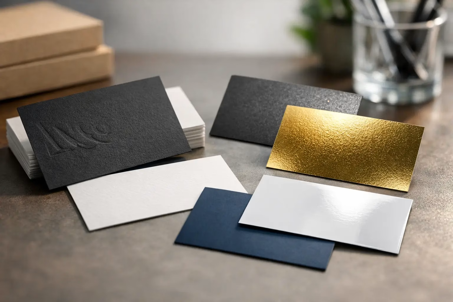
A business card is often handed over in a fast moment: after a meeting, at a trade show, during a property viewing, or across a retail counter. The best business card finishes make that moment feel more deliberate. They affect how the card looks under light, how it feels in the hand, how well it resists marks, and whether your brand comes across as premium, practical, modern, or bold.
The right choice is not always the most expensive option. A matte card can be exactly right for a consultant who wants a refined, easy-to-read design, while a glossy finish may suit a restaurant, beauty brand, or retailer using strong photography and vibrant colors. Start with the impression you want to leave, then match the finish to your artwork, audience, and daily use.
What a Business Card Finish Actually Does
A finish is the final surface treatment applied to a printed card. It can protect the printed design, change the texture, add shine, or highlight selected details such as a logo, name, or pattern. Finishes also influence practical performance. Some show fingerprints more easily, some are easier to write on, and some can make small text harder to read if used without care.
Paper stock and finish work together. A heavier card stock gives a more substantial feel, but the finish determines much of the visual personality. A well-designed card on quality stock with the wrong finish can still feel mismatched. For example, a highly reflective gloss may compete with an understated luxury logo, while an uncoated surface may not protect a photo-led design as well as a laminated card.
Best Business Card Finishes by Brand Goal
Matte Lamination for a Professional, Understated Look
Matte lamination is one of the safest choices for corporate stationery, professional services, real estate teams, technology companies, and B2B brands. It creates a smooth, non-shiny surface that reduces glare and keeps text readable under office lighting or direct sunlight. Dark colors often look especially polished with matte lamination.
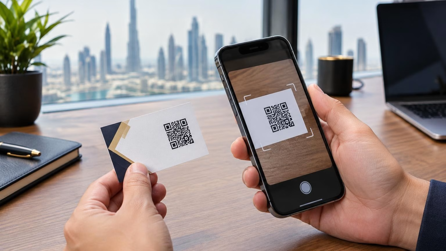
This finish feels calm and considered rather than flashy. It also offers good protection against light handling, which matters for cards carried in wallets, cardholders, and exhibition badge holders. Matte is a practical choice when your design uses fine lines, small type, QR codes, or a large amount of written information.
The trade-off is that very dark matte cards can sometimes show scuffs or fingerprints, particularly if they are handled often. A soft-touch finish or a selective raised detail can help create a more premium result, but the artwork and production method should be reviewed first.
Gloss Lamination for Bright Color and Photography
Gloss lamination has a reflective surface that makes colors appear brighter and images look more energetic. It is a strong fit for product-based businesses, food and beverage brands, salons, automotive businesses, event companies, and promotional campaigns. If your card features a bold product image, colorful illustration, or high-contrast graphic, gloss can add visual impact quickly.
The protective layer also helps the card withstand everyday handling. This can be useful for high-volume distribution at events, retail counters, hospitality venues, or door-to-door promotions. Gloss is typically an affordable way to make full-color artwork feel more vivid.
However, shine is not right for every design. Light reflections can make small copy harder to read, and the surface can show fingerprints. Avoid relying on gloss alone to create a premium effect. A clean layout, good logo placement, and the right stock still do most of the work.
Soft-Touch Lamination for a Premium Tactile Feel
Soft-touch lamination is made for cards that should feel memorable before they are read. Its velvety, suede-like texture gives a smooth and luxurious impression without the high shine of gloss. It works particularly well for premium hospitality, interior design, architecture, luxury retail, beauty, finance, and executive personal brands.
This finish is often chosen for dark, minimal designs because it makes simple layouts feel intentional. A black, navy, charcoal, or deep green card with soft-touch lamination can look sophisticated while staying easy to read. Add selective foil or spot UV to a logo, and the contrast becomes even more noticeable.
Soft-touch costs more than standard matte or gloss finishes, so it is best used where the tactile experience supports the brand value. It can also be more sensitive to scratches than conventional lamination. For cards that will be distributed in very large quantities or handled roughly, a standard matte laminate may offer better value.
Spot UV for Selective Shine and Contrast
Spot UV applies a clear glossy coating only to chosen areas of the card. It is commonly used on logos, icons, names, patterns, or product details. Against a matte or soft-touch background, it creates a sharp contrast that catches the light when the card is moved.
This is a smart option when you want a premium detail without covering the full card in shine. It works well for brands with a distinctive logo or a simple graphic system. A business card with spot UV should not be overloaded with effects. One clear focal point is usually more effective than several glossy elements competing for attention.
Very fine spot UV details may not reproduce as cleanly as broader shapes, especially when the design includes extremely small lettering. Keep the selected artwork bold enough to hold its shape, and ask your print partner to check the file before production.
Foil Stamping for High-Value Brand Details
Foil stamping uses metallic foil to create a reflective detail, often in gold, silver, rose gold, copper, or other custom shades. It is ideal for brands that need a strong premium signal: luxury services, high-end property, boutique retail, weddings, exclusive events, and executive networking cards.
Foil is most effective when used with restraint. A foil logo or name on a dark matte or soft-touch card can communicate quality immediately. Using foil across large areas may increase cost and can make a design feel overly decorative if it does not align with the brand.
Foil is a specialty finish, so production time and pricing may differ from standard laminated cards. It is worth planning ahead for launches, trade shows, or corporate events rather than treating it as a last-minute print requirement.
Raised UV and Embossing for Dimension
Raised UV creates a tactile, elevated gloss on selected areas, allowing customers to feel the logo or pattern with their fingertips. Embossing and debossing reshape the paper itself, producing a raised or recessed design. Both options add dimension and are highly effective for minimal, high-quality cards.
Raised UV is especially striking on soft-touch cards, while embossing works beautifully with heavier uncoated or textured stocks. These finishes are best for cards with a simple layout and enough empty space around the featured detail. On a crowded card, the effect can feel lost.
Because these processes require precise alignment and specialized production, they are generally better suited to premium quantities and carefully approved artwork. They are not always necessary for an everyday sales card, but they can make a leadership, partnership, or VIP card feel distinctly different.
Consider Writable Areas Before You Print
Some businesses need to write appointment times, discount codes, delivery details, or follow-up notes on their cards. Gloss, laminate, spot UV, and foil surfaces are not ideal for standard pens. If handwriting matters, leave one side uncoated or reserve a clearly marked writable area using uncoated stock.
This is particularly useful for clinics, salons, service businesses, event teams, and retailers. A polished front with a practical writable back often delivers the best balance between brand presentation and daily usability.
Match the Finish to the Design, Not Just the Trend
The best business card finishes are the ones that strengthen what is already good about your design. A card with bold photography may benefit from gloss. A legal firm or consulting practice may be better served by matte. A luxury brand can use soft-touch with foil, while a creative studio may choose textured stock and an embossed mark.
Before production, check that your logo has sufficient contrast, text is large enough to read, and any QR code has clear space around it. Specialty finishes should enhance essential information, not hide it. Consider how the card will be used as well: cards given at exhibitions need durability, while cards used in private client meetings can justify more tactile detail.
Choose a Finish That Supports Reordering
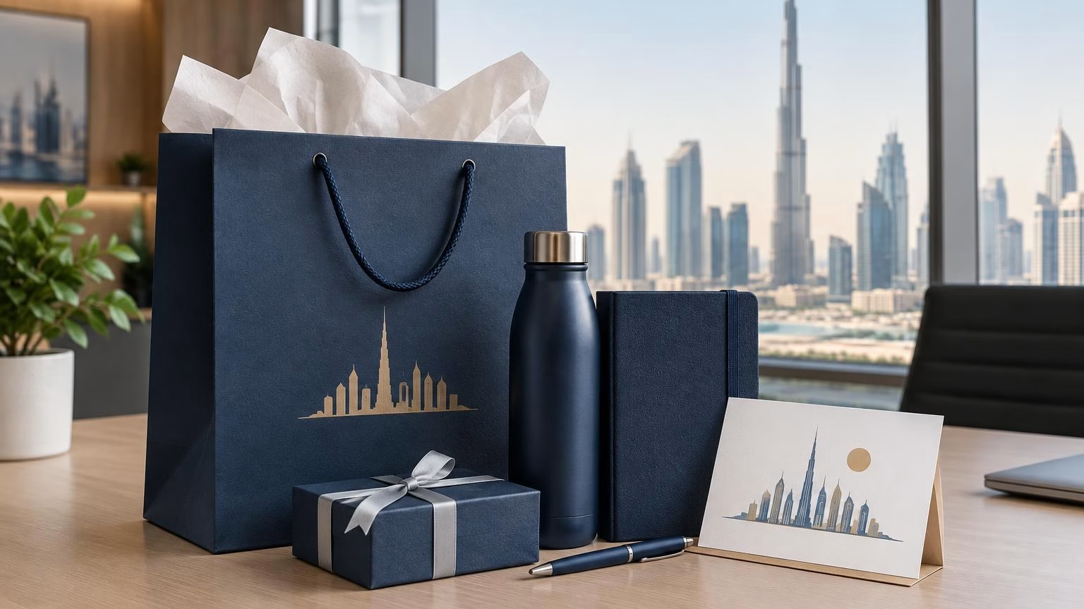
A business card is a repeat-use item, not a one-time design experiment. When selecting paper and finishing, think about consistency across future print runs, staff cards, company stationery, presentation folders, and branded packaging. Keeping the same finish available makes it easier to reorder and protects a recognizable brand appearance.
IWPrinting.com can help businesses select stock, finish, quantity, and production options that fit both the design and the intended use. A quick artwork review before printing can prevent common issues such as unreadable text, weak contrast, or effects placed too close to trim edges.
A card does not need every premium treatment to make an impression. It needs a finish that feels right in the hand, looks right for the brand, and gives the recipient a reason to keep it.