
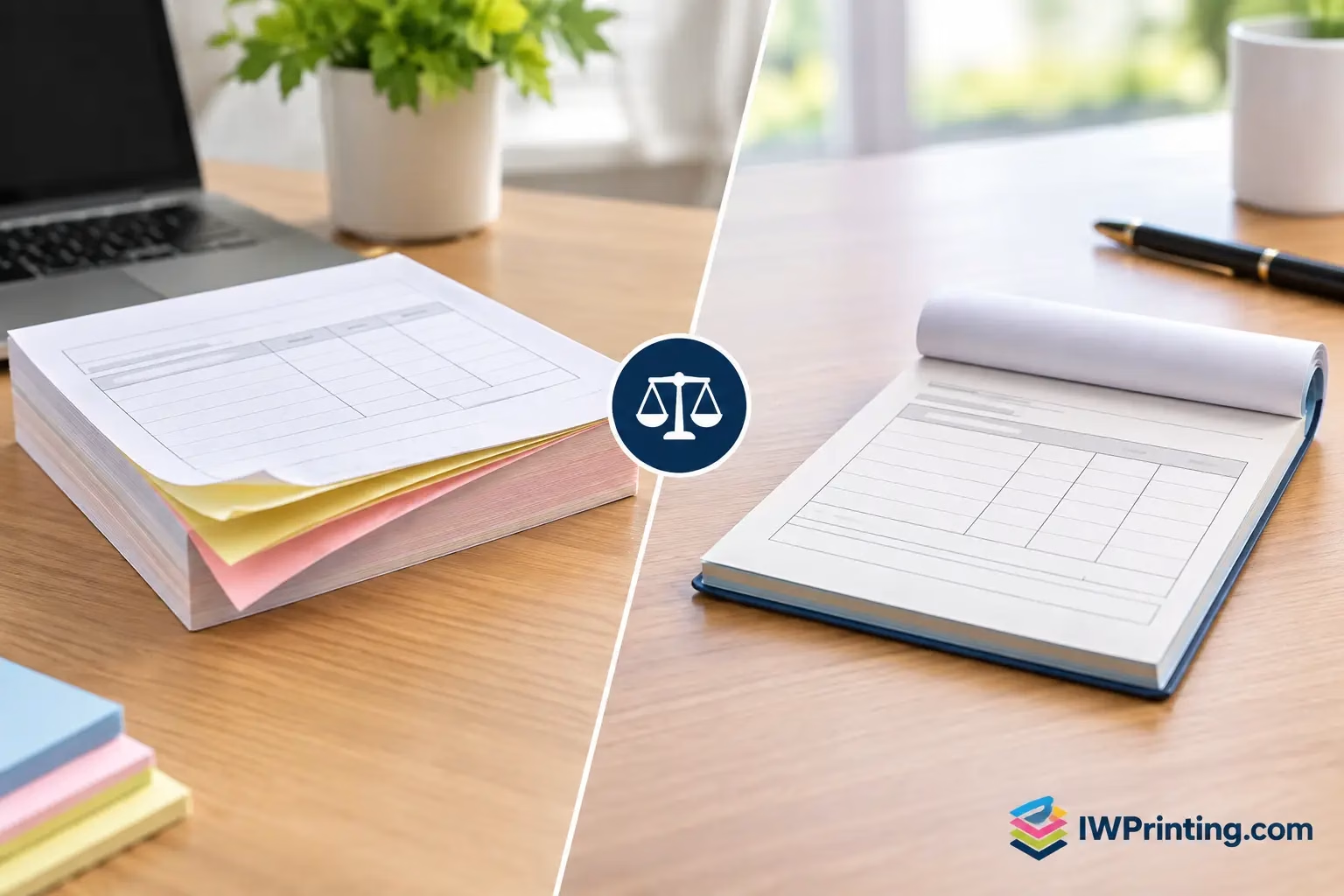
NCR Versus Receipt Books: Which Fits Your Business?
Compare NCR versus receipt books for invoices, orders, and payments. Choose the right format, copy count, and finish for clear daily business records.
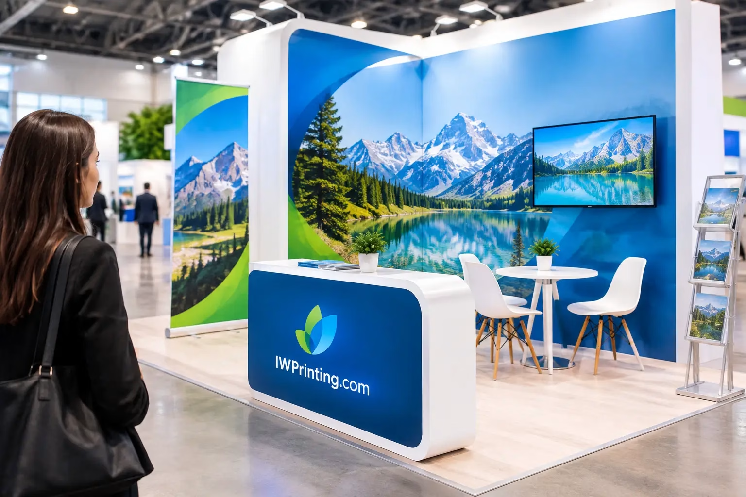
A busy exhibition floor gives visitors only a few seconds to decide where to look next. If your company name is too small, your offer is unclear, or your key message sits behind a product table, even a well-built booth can be overlooked. Knowing how to plan exhibition signage means designing a clear path from first glance to real conversation.
The goal is not to cover every surface with graphics. It is to make the right information visible at the right moment: who you are from across the aisle, what you offer as visitors approach, and why they should speak to your team once they are at the stand. A focused signage plan makes your space easier to find, easier to understand, and more likely to produce qualified leads.
Before choosing roll-up banners, backdrops, fabric displays, counter wraps, or flags, consider how people will move around your booth. Most visitors will see your exhibition space from a distance, pass it at an angle, then stop only if the message feels relevant. Your signs should support each of those stages.
Your long-distance signage needs a simple job: identify your brand. This is usually the logo, company name, and a short visual cue placed high enough to be seen above nearby displays. At this stage, detailed service lists and small promotional copy will not be read.
At medium distance, visitors should quickly understand what you do. A clear headline such as “Custom Packaging for Retail Brands” is stronger than a paragraph describing every capability. Close-range graphics can carry supporting details, product features, QR codes, event-only offers, certifications, or contact information.
This approach prevents a common exhibition mistake: trying to turn one banner into a company brochure. Give each sign one primary purpose, and your overall booth will feel more professional and easier to navigate.
Exhibition signage should match the reason you booked the space. A brand awareness event needs bold identity and memorable visuals. A product launch needs an obvious product story. A lead-generation booth may need a clear call to action that encourages visitors to request a quote, book a demo, or scan a code.
Set one main objective and one secondary objective. For example, a construction supplier may want to introduce a new service while collecting contacts from project managers. A retailer may be focused on showing a seasonal collection and driving wholesale inquiries. The signage hierarchy changes depending on that goal.
Also consider the audience. A technical buyer may respond to performance data, approved standards, and application images. A hospitality buyer may care more about finish quality, turnaround time, and customization. Use the language your visitors already use in their work.
A practical booth plan separates signage into zones. This makes it easier to budget, design, and review the final layout before production.
This is what people see from the aisle. It includes overhead signs, large back walls, tall fabric displays, and high-positioned logos. Keep text minimal, use strong contrast, and make sure the brand name remains legible from the expected viewing distance. If an organizer restricts hanging structures, tall freestanding displays or a raised back wall can provide the necessary visibility.
This zone tells visitors what you offer. It often appears on the main backdrop, side panels, product towers, or large posters. Lead with a benefit-led message, then support it with a few carefully chosen visuals or categories. A single strong image of the product in use can work harder than several unrelated stock photos.
Once someone enters the booth, give them reasons to stay. Counter graphics, tabletop signs, digital displays, product labels, and demonstration panels can explain options without forcing staff to repeat basic information. This is also the right place for a QR code, provided it leads to a useful page, catalog, offer, or appointment form.
Larger stands often need practical wayfinding. Signs for consultation areas, product sections, meeting rooms, reception points, and refreshment stations improve flow and make the booth feel organized. These signs can be smaller, but they should still use consistent fonts, colors, and materials.
The best signage format depends on booth size, event rules, installation time, and whether you plan to reuse the display. Portable solutions such as roll-up banners, pop-up displays, fabric backdrops, and branded counters are efficient for frequent exhibitions because they are easier to transport, store, and reassemble.
For a premium launch, large-format wall graphics, custom-built display units, 3D letters, illuminated signs, or printed flooring can create a stronger visual impact. These options require more planning and may involve venue approval, electrical access, build schedules, and professional installation.
Do not assume the largest sign is always the best choice. A compact booth with one clean backdrop, a branded counter, and two well-positioned banner stands can be more effective than a crowded setup with competing messages. On the other hand, a large island booth may need signage visible from multiple directions, not a single front-facing wall.
Ask the organizer for the exhibitor manual early. Check height limits, permitted materials, fire ratings, hanging regulations, power availability, loading access, and approved installation hours. These details can affect both production choices and cost.
Exhibition halls are visually noisy. Your signage competes with bright lights, neighboring stands, moving crowds, and distance. Design for quick reading, not close inspection.
Use high contrast between text and background. Dark type on a light background or light type on a dark background is usually safer than low-contrast brand colors placed together. Avoid thin fonts, long uppercase paragraphs, and overly detailed backgrounds behind important copy.
Keep headlines short. If a visitor cannot understand the main message in three to five seconds, simplify it. The same rule applies to pricing, offers, and calls to action. “Request a Free Sample” is clearer than a vague statement such as “Let’s Build Something Better Together.”
Images should be high resolution at final print size. A file that looks sharp on a laptop can appear blurred on a large backdrop. Supply logos in vector format where possible, and confirm the artwork dimensions, bleed, scale, and color mode with your production partner before approving the job.
Late copy changes are one of the fastest ways to delay exhibition printing. Agree on your message, brand assets, product images, and contact details before artwork reaches final approval.
Create a simple content checklist covering your logo, headline, key service or product message, call to action, website or QR destination, contact information, and any required legal or partner logos. If you are promoting several product categories, decide which one deserves the headline and which ones belong in supporting copy.
QR codes deserve special attention. Make them large enough to scan from a comfortable standing distance, leave clear space around them, and test them on multiple phones before printing. Include a short instruction nearby, such as “Scan to view our project portfolio,” so visitors know what they will receive.
A signage budget should account for more than printed panels. Include design, pre-event proofing, hardware, lighting, installation, dismantling, transportation, and storage. If the stand will travel between events, durable modular systems may cost more initially but reduce replacement costs later.
Spend first on the items that drive visibility: the main backdrop, elevated branding, and one clear engagement point. Then add supporting signs based on the remaining budget. There is little value in premium brochure holders if visitors cannot tell what your business offers from the aisle.
For UAE exhibitions, allow time for venue coordination and delivery scheduling, particularly for large-format graphics, custom fabrication, or signage that needs on-site installation. IWPrinting.com can support businesses from artwork preparation through production, delivery, and professional exhibition setup, helping reduce last-minute coordination between multiple suppliers.
Before the event, review a scaled floor plan and visualize what a visitor will see from each open side of the booth. Check whether counters, furniture, displays, or staff positions block key graphics. Confirm that the logo is not hidden behind lighting trusses or mounted too low for aisle visibility.
If possible, print a small proof or inspect a sample of the chosen material. Colors, finishes, and readability can change under exhibition lighting. Matte surfaces reduce glare, while glossy finishes can make colors appear more vivid but may reflect spotlights. The right choice depends on placement and the venue environment.
Once installed, walk past your booth as a visitor would. Can you identify the brand, offer, and next action without an explanation? If the answer is yes, your signage is doing its job. Let your sales team focus on the conversations that turn a well-planned exhibition presence into business after the event.
Compare NCR versus receipt books for invoices, orders, and payments. Choose the right format, copy count, and finish for clear daily business records.
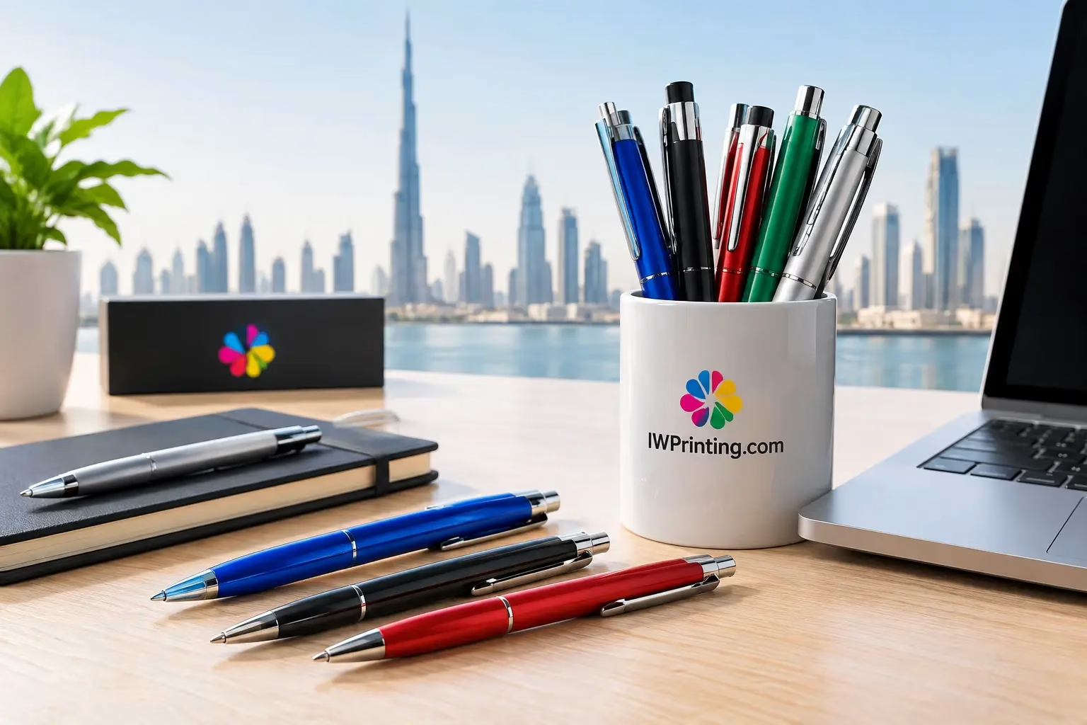
Choose promotional pen printing in Dubai for branded giveaways that look professional, suit your budget, and arrive ready for events, offices, and campaigns.
WhatsApp us
Printing, corporate gifts and signage — tell us what you need and let AI help you find it.
Ask naturally. IWPrint AI can understand your product, quantity, budget and requirement.