
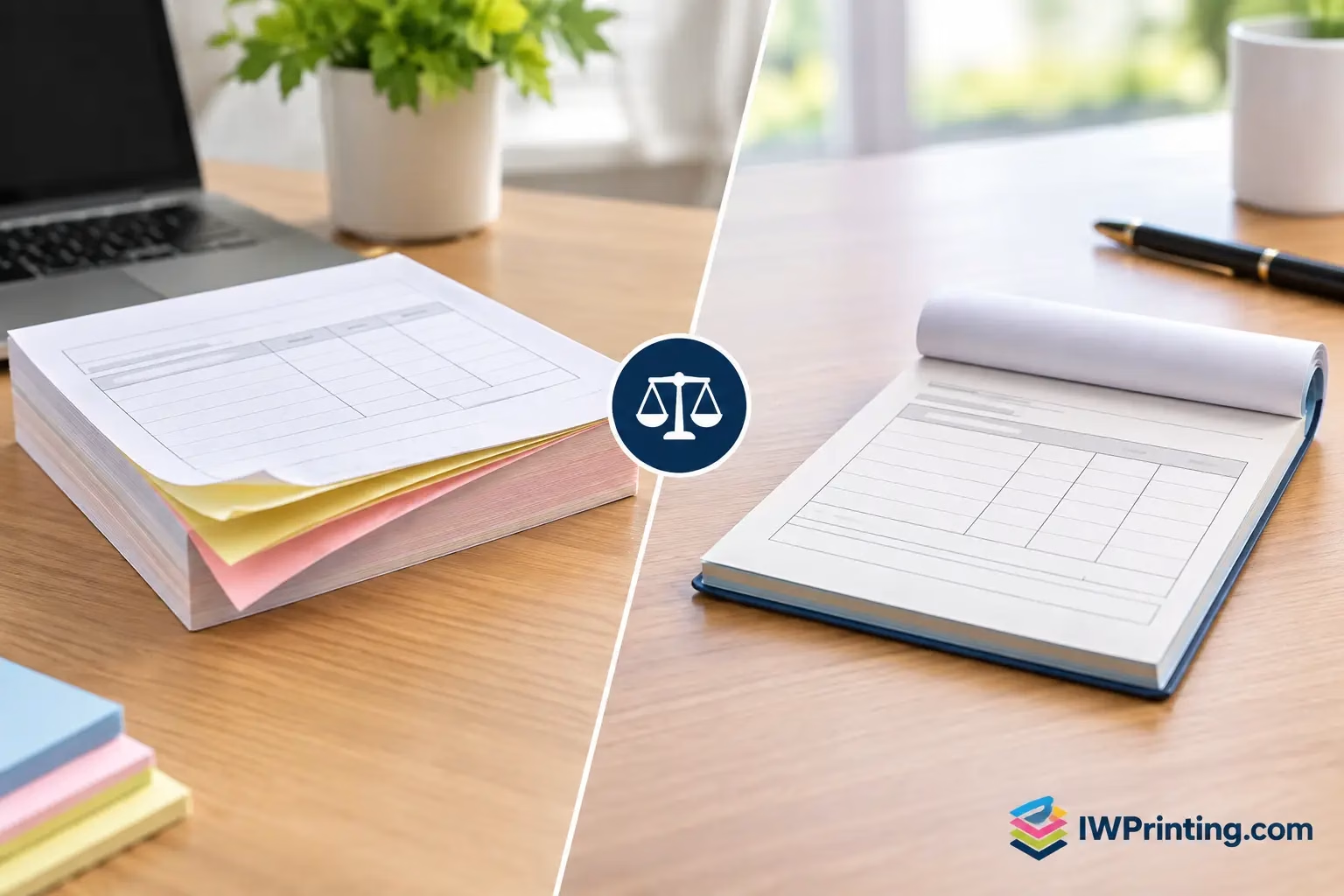
NCR Versus Receipt Books: Which Fits Your Business?
Compare NCR versus receipt books for invoices, orders, and payments. Choose the right format, copy count, and finish for clear daily business records.
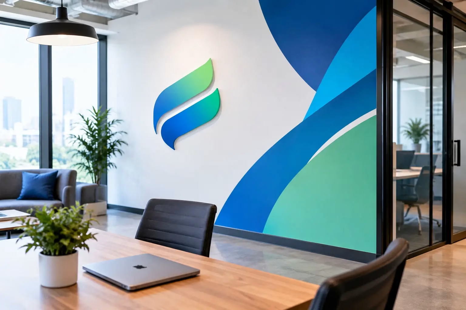
A reception wall is often the first real introduction to your business. Before a visitor speaks with your team, they see your logo, colors, standards, and level of attention to detail. Effective office wall branding turns that moment into a clear, professional brand experience rather than leaving it to blank paint, temporary posters, or mismatched signage.
For offices, showrooms, clinics, schools, corporate headquarters, and shared workspaces, the right wall graphics do more than decorate. They help people find their way, reinforce company culture, create confidence, and make a space feel intentionally yours. The best result is not the busiest wall. It is a branded environment that supports the way your business operates.
Office branding has to work for more than photographs. It should serve employees who use the space every day and visitors who may be seeing your business for the first time. A clean logo feature at reception can establish trust quickly. Directional graphics can reduce confusion in larger premises. Values, timelines, product visuals, and team recognition walls can give staff a stronger connection to the organization.
That is why a single design approach rarely suits every wall. A client-facing financial office may need restrained colors, acrylic logo signage, and subtle frosted glass graphics. A creative agency may use large-format murals, campaign artwork, and bold typography. A healthcare provider may prioritize calm color palettes, privacy films, safety messaging, and simple wayfinding.
The common goal is consistency. Your office should look connected to your website, stationery, packaging, vehicle graphics, event displays, and customer-facing signage. When each touchpoint uses the same visual language, the brand becomes easier to recognize and trust.
Before choosing materials or approving artwork, walk through the office as a first-time guest. Notice what is visible from the entrance, reception desk, waiting area, meeting rooms, corridors, elevators, and work zones. This helps identify which walls carry real value and which can remain quiet.
Start with the arrival sequence. The reception area usually deserves the strongest brand statement because it appears in visitor photos, meetings, and day-to-day staff arrivals. A dimensional logo, acrylic sign, LED lettering, or premium printed feature wall can make this area feel established without overfilling it.
From there, consider movement through the space. Meeting room names, floor markers, department labels, and directional signs should be easy to scan from a distance. If visitors repeatedly ask where to go, that is not only a reception issue. It is an opportunity for better environmental graphics.
Employee areas deserve attention as well. Walls in collaboration spaces can feature company values, milestone timelines, product achievements, customer stories, or carefully selected motivational messaging. These pieces are most effective when they reflect real work and real culture. Generic slogans can feel forced, especially when the office experience does not support them.
Material selection affects cost, finish, durability, installation time, and future updates. There is no single best option. The right choice depends on wall condition, lighting, expected lifespan, cleaning requirements, and whether the message may change.
Vinyl wall graphics are a practical choice for logos, patterns, murals, campaign visuals, and large-format graphics. They offer strong color reproduction and can cover a wide area at an accessible cost. For smooth painted walls, a quality vinyl application can deliver a sharp, professional result. Textured walls, damp surfaces, and recently painted walls need extra assessment because adhesion may be affected.
Printed wallpaper is well suited to full-wall murals and immersive interiors. It can create a more refined finish than a standard poster-style application, especially in boardrooms, lobbies, retail offices, and hospitality settings. The artwork should be prepared at the correct scale so images, gradients, and small text remain clear when printed large.
Acrylic signs and 3D letters add depth and permanence. They are often used for reception logos, room names, and key corporate messaging. Options such as clear acrylic, colored acrylic, brushed metal finishes, raised PVC letters, and illuminated lettering can be matched to your brand and budget. These signs cost more than flat graphics, but they can create a premium focal point where it matters most.
Frosted window film is valuable when offices have glass partitions. It supports privacy while carrying logos, patterns, department names, or simple directional information. It also helps prevent people from walking into clear glass panels, which makes it useful in busy workplaces.
For temporary campaigns, seasonal promotions, exhibitions, or leased spaces, removable graphics can be the smarter investment. They allow a business to refresh messaging without committing to permanent fabrication. The trade-off is that removable products may not provide the same long-term finish or lifespan as permanent signage.
A design that looks good on a computer screen can fail once it is installed across a 20-foot wall. Text may be too small, colors may shift under warm lighting, or important content may be blocked by furniture, plants, doors, and people. Professional office wall branding needs a site-aware design process.
Use large, readable typography for messaging viewed from hallways or reception areas. Keep essential information short. A wall is not a brochure, and trying to place every service, achievement, and brand promise in one area usually weakens the message. Give one wall one job: welcome, direct, inform, celebrate, or inspire.
Color also needs practical attention. Dark colors can look sophisticated but may make a narrow corridor feel smaller. Very light graphics can disappear against bright windows. High-contrast colors improve legibility, while brand colors can be used strategically in feature areas, shapes, and accents.
Lighting deserves the same level of planning. Spotlights can elevate dimensional letters, but they may create glare on glossy surfaces. Matte laminates and non-reflective materials are often better for walls facing strong natural light or overhead fixtures. A site survey before production helps prevent costly surprises during installation.
The most successful office branding projects use a clear hierarchy. Reception branding leads the experience. Wayfinding makes the office easy to use. Culture and storytelling walls add depth. Decorative elements support the overall atmosphere without competing for attention.
This structure also makes budgeting easier. If the full office cannot be completed at once, begin with the high-impact areas: reception, main meeting rooms, glass partitions, and primary directional signage. Additional walls can be added in phases while using the same approved colors, fonts, layout rules, and materials.
For multi-location businesses, a repeatable brand system is especially valuable. A headquarters, branch office, training center, and showroom can share the same core identity while adapting to each site’s size and audience. This avoids inconsistent branding when different teams order signage at different times.
Wall branding is only as good as its measurement and installation. Accurate site dimensions, wall photographs, surface checks, and placement approvals should happen before printing begins. A few centimeters can matter when aligning a mural with a door frame, ceiling line, or reception counter.
Timing matters too. Large installations may create noise, require access equipment, or temporarily block corridors and meeting rooms. Many businesses schedule work outside normal operating hours to keep disruption low. If the office is new or recently renovated, confirm that painting, electrical work, and cleaning are complete before graphics are applied.
At IWPrinting.com, businesses can coordinate design, print production, signage fabrication, and installation through one production partner. This is particularly useful when a project combines wall graphics with 3D reception signs, frosted films, safety signs, window branding, and event or retail materials.
A branded office should feel current, but it does not need a full redesign every year. The practical approach is to make permanent elements timeless and reserve changeable areas for campaigns, awards, product launches, seasonal messaging, or employee recognition.
Keep core logo signage, wayfinding, and brand patterns consistent. Use frames, interchangeable panels, removable vinyl, or designated display zones for content that changes more often. This protects your budget while keeping the workspace active and relevant.
When planning your next office update, start with the wall that people see first and ask what it needs to communicate in five seconds. A clear answer will lead to better design choices, smarter production decisions, and a space that works as hard as your team does.
Compare NCR versus receipt books for invoices, orders, and payments. Choose the right format, copy count, and finish for clear daily business records.
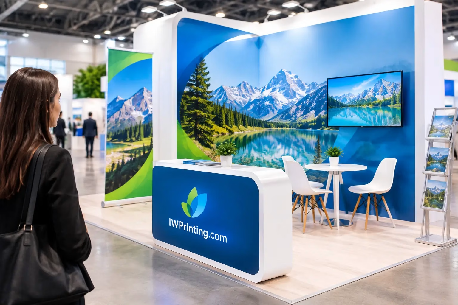
Learn how to plan exhibition signage that guides visitors, elevates your brand, and fits your booth, budget, timeline, and event goals with confidence.
WhatsApp us
Printing, corporate gifts and signage — tell us what you need and let AI help you find it.
Ask naturally. IWPrint AI can understand your product, quantity, budget and requirement.