
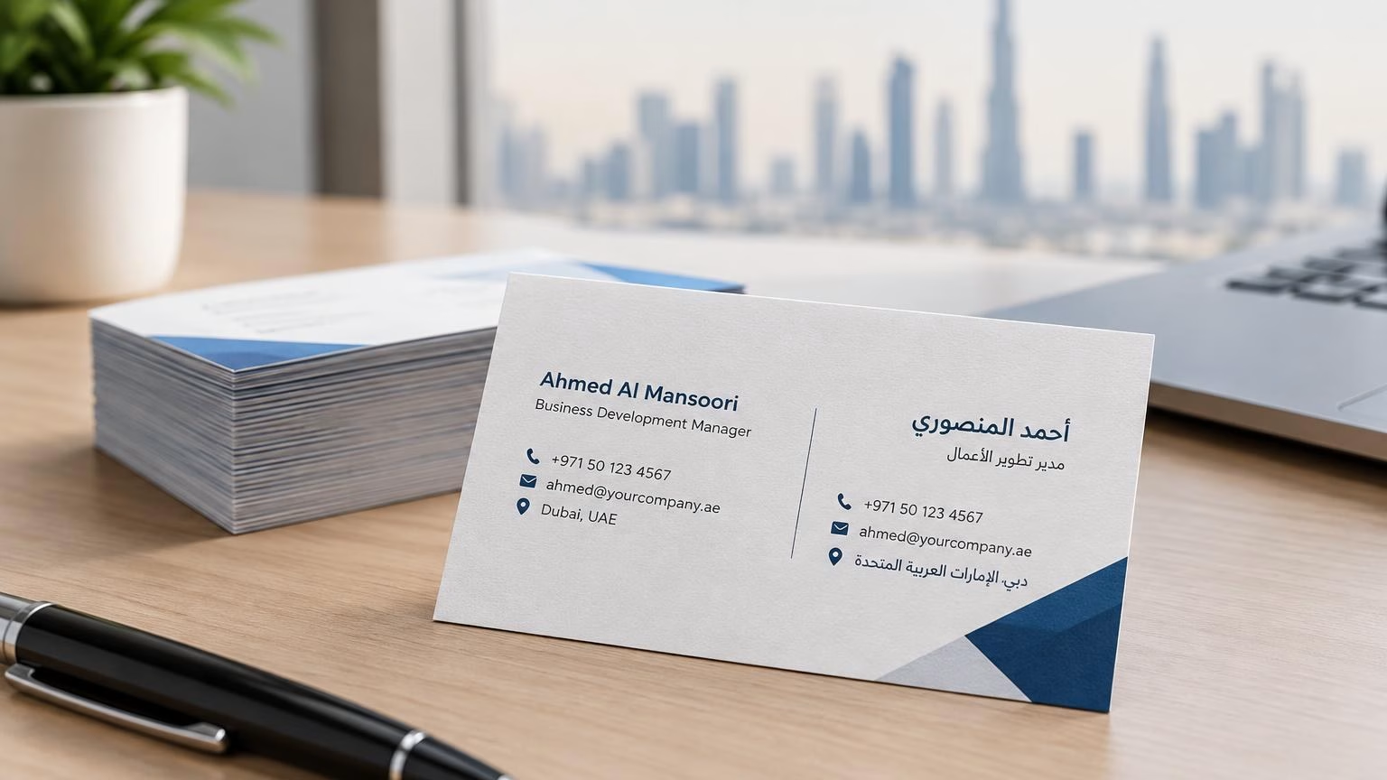
阿联酋阿拉伯语与英语双语名片印刷:排版与校对指南
阿联酋双语名片要同时照顾阿拉伯语从右向左阅读、英语从左向右阅读的习惯。本文介绍版面规划、姓名与联系方式校对、印前文件检查及印量安排,帮助迪拜及阿联酋企业减少常见错误。
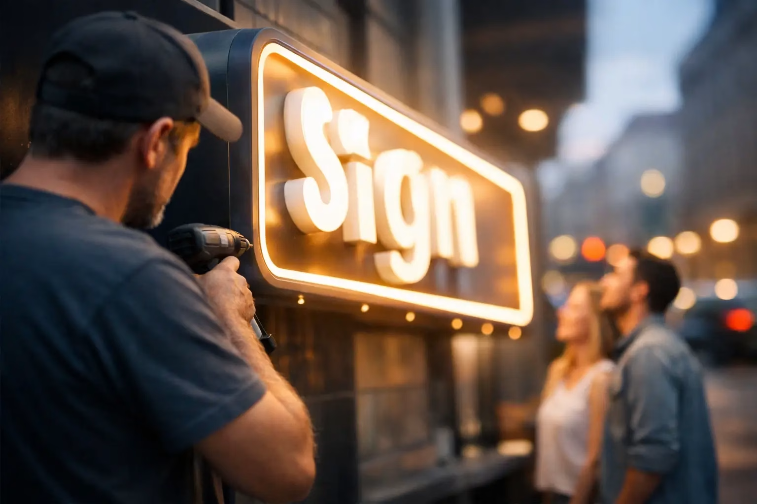
A customer can decide whether to enter your store before they reach the door. From a roadside pylon sign to an illuminated logo above a reception desk, signboard making turns a business name into a clear, visible point of contact. The right sign helps people find you, understand what you offer, and remember your brand after they leave.
For businesses, the goal is not simply to make a sign look attractive. It must be readable at the right distance, suited to its location, strong enough for its environment, and consistent with the rest of the brand. A sign that looks excellent in a design proof but disappears at night or fades after a summer outdoors is not a good investment.
Every sign has a practical purpose. Before choosing acrylic, aluminum, LEDs, vinyl, or 3D letters, define what the sign needs to achieve. A storefront sign must attract attention and establish trust. Wayfinding signs must move people through an office, hospital, school, or retail location without confusion. Safety signs need immediate clarity. Exhibition signs must create impact quickly in a crowded venue.
This first decision affects everything that follows, including size, material, color, lighting, mounting method, and budget. A small indoor door plaque and a large outdoor façade sign should not be specified the same way, even when they carry the same logo.
It also helps to consider viewing distance. A sign read from across a parking lot needs larger lettering and fewer words than a sign placed beside a reception counter. Trying to include a full list of services on a distant sign usually reduces its effectiveness. Your business name, logo, and one clear message are often enough.
Material selection is where appearance, durability, and price meet. There is no single best option for every project. The best choice depends on whether the sign is indoors or outdoors, temporary or permanent, illuminated or non-illuminated, and exposed to heat, dust, moisture, or direct sunlight.
Acrylic is a popular choice for reception signs, office branding, wall logos, room signs, and retail displays. It has a clean, modern finish and can be cut into custom shapes, printed in full color, layered for depth, or combined with vinyl graphics. Clear acrylic can create a floating effect, while colored or frosted acrylic supports a more defined brand look.
Acrylic works particularly well when customers see the sign at close range. It gives offices, clinics, showrooms, and hospitality spaces a professional finish without requiring the cost of major structural fabrication.
Three-dimensional letters create stronger visual impact than flat graphics. They can be made from acrylic, stainless steel, aluminum, PVC, or a combination of materials. Depending on the design, 3D letters may be front-lit, backlit, side-lit, or non-illuminated.
For a corporate office or premium retail frontage, built-up letters can make a logo feel established and permanent. For outdoor use, material quality and fabrication standards matter. Thin or poorly finished letters may warp, discolor, or lose their visual appeal over time.
Aluminum composite panels are commonly used for outdoor signs because they are lightweight, durable, and suitable for printed graphics or raised lettering. They are a practical option for shop fronts, directional signs, site boards, property branding, and construction signage.
Metal signs offer another level of strength and can suit industrial locations, building directories, and premium branded installations. They typically cost more than basic printed boards, but their long service life can make them a sensible choice for permanent applications.
Vinyl is useful for window graphics, wall branding, vehicle graphics, promotional messages, and temporary campaigns. It can be cut into lettering or printed with detailed artwork, photographs, and product visuals. The finish can be matte, gloss, frosted, or reflective depending on the setting.
Vinyl is often more affordable than fabricated signage, but it is not always the right choice for a high-impact business name sign. It works best when the surface is smooth, the message may change, or the project needs fast production and installation.
A sign can feature excellent colors and premium materials yet still fail if people cannot read it quickly. Readability should guide the design from the beginning.
Use typefaces that remain clear from the intended viewing distance. Highly decorative fonts may suit a small brand detail, but they are difficult to read on a storefront or directional sign. Strong contrast matters too. Dark lettering on a light background, or light lettering on a dark background, generally performs better than low-contrast color combinations.
Keep the main message short. Customers driving past a sign have only seconds to process it. A business name, recognizable logo, and a simple category such as “Dental Clinic,” “Real Estate,” or “Fresh Bakery” can be more effective than a crowded layout filled with small text.
Brand consistency should still be maintained. Use approved logo files, brand colors, and fonts wherever possible. If your printed brochures, packaging, uniforms, vehicle graphics, and signs all look unrelated, the business appears less organized. A coordinated visual identity helps customers recognize you across multiple touchpoints.
Lighting is not only a decorative add-on. For many businesses, it determines whether the sign works after sunset, inside shopping centers, or in shaded locations.
Front-lit channel letters provide a bright, direct appearance and are well suited to storefronts that need strong nighttime visibility. Backlit letters create a halo effect against the wall, offering a more refined look for offices, restaurants, salons, and premium retail brands. LED light boxes are effective when the design includes detailed graphics, product images, or changing promotional panels.
Non-illuminated signs can be the better choice when a location has good ambient lighting, the sign is indoors, or the budget needs to remain focused on material quality and installation. The trade-off is simple: lower upfront cost may mean less visibility at night. Consider actual operating hours, nearby lighting, and how customers approach the location before deciding.
Signboard making does not end when the artwork is approved. Installation conditions can affect the sign size, weight, mounting hardware, electrical requirements, and final appearance.
A wall-mounted sign may need spacers, studs, frames, or concealed fixings. A freestanding sign may require a fabricated base or concrete footing. Illuminated signage needs safe electrical planning and access for maintenance. Window graphics require careful surface preparation to avoid bubbles, lifting edges, or uneven alignment.
Site surveys are valuable for larger or more complex projects. They help confirm measurements, check wall surfaces, identify power access, review visibility angles, and avoid costly adjustments after production. For multi-location businesses, standardized specifications also make future reorders easier and keep the brand consistent from one site to another.
In the UAE, outdoor conditions deserve special attention. Heat, UV exposure, wind, and dust can affect printed surfaces, adhesives, lighting components, and finishes. Choosing materials designed for the environment is usually more cost-effective than replacing low-grade signage early.
The strongest business spaces use signage as a connected system. The exterior sign brings people in. Window graphics communicate offers or operating hours. Directional signs reduce confusion. Reception branding reassures visitors they are in the right place. Wall graphics, door signs, safety notices, and displays continue the experience throughout the location.
This approach is especially useful for offices, retail stores, clinics, schools, hotels, warehouses, and event venues. It helps visitors move with confidence while giving the brand a more professional presence. Not every area needs an oversized logo, but every sign should look like it belongs to the same organization.
For a new opening, renovation, or rebrand, plan signage alongside other printed materials. Business cards, brochures, menus, packaging, promotional items, exhibition displays, and branded apparel can all use the same visual direction. Working with one production partner can reduce coordination issues and help maintain consistent colors, finishes, and deadlines.
Clear artwork prevents delays and avoidable cost. Vector logo files are preferred for logos, lettering, and cut shapes because they can be scaled without losing quality. High-resolution images are necessary for large printed graphics. If the artwork is not ready, professional graphic design support can help prepare files that match the chosen material and production method.
Before approving a signboard order, confirm the final dimensions, material, finish, color references, illumination requirements, mounting method, quantity, and installation location. Ask to review the wording carefully, particularly phone numbers, website addresses, unit numbers, and directional information. A single typo on a large sign is expensive to correct.
IWPrinting.com supports businesses with customized signboard production, design coordination, fabrication, installation, and delivery, helping projects move from concept to finished display with fewer handoffs.
A well-planned sign keeps working long after the installation team leaves. Give it a clear job, choose materials that fit the location, and make every word easy to read. That is how a sign becomes a practical business asset rather than just another item on the wall.
阿联酋双语名片要同时照顾阿拉伯语从右向左阅读、英语从左向右阅读的习惯。本文介绍版面规划、姓名与联系方式校对、印前文件检查及印量安排,帮助迪拜及阿联酋企业减少常见错误。
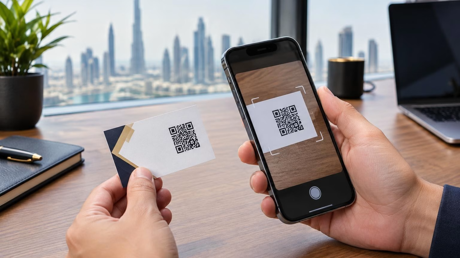
A QR code can make a business card a useful bridge to your digital presence. Learn what to link, how to prepare the artwork and how to test scanability before printing in Dubai or elsewhere in the UAE.
I can help you find the right printing, corporate gifts, signage and display products. Tell me what you need, your quantity, and your budget if you have one.
WhatsApp us