
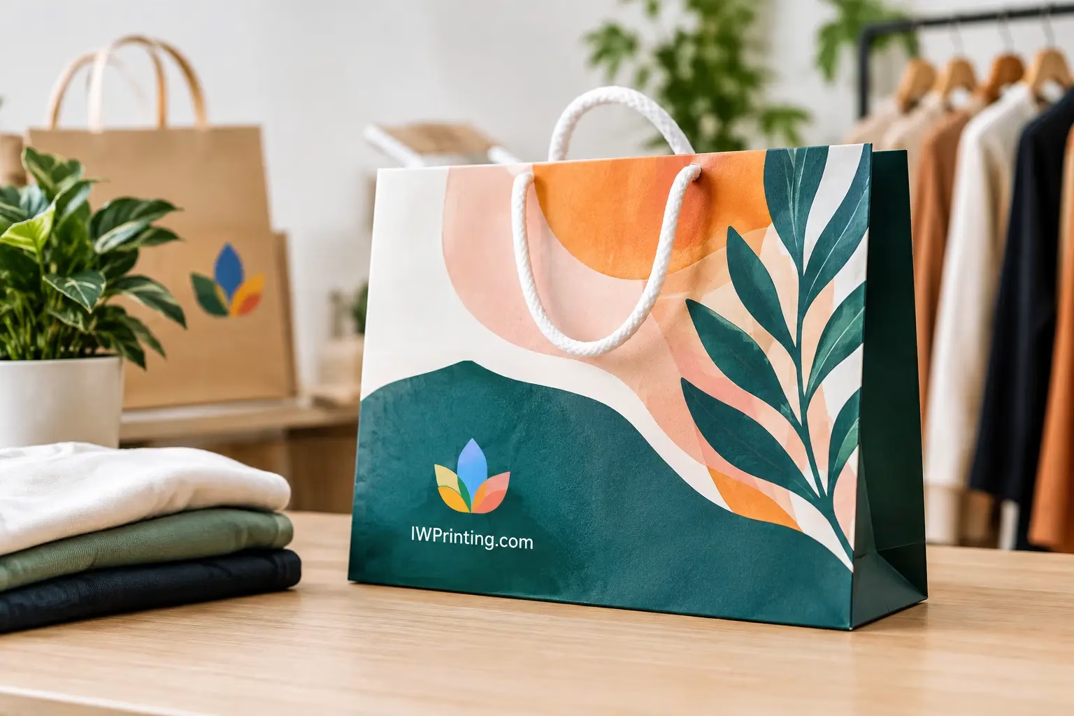
Shopping Bag Printing That Builds Brand Recall
Shopping bag Printing turns every purchase into brand exposure. Choose materials, sizes, finishes, and artwork that fit your product, budget, and customers.
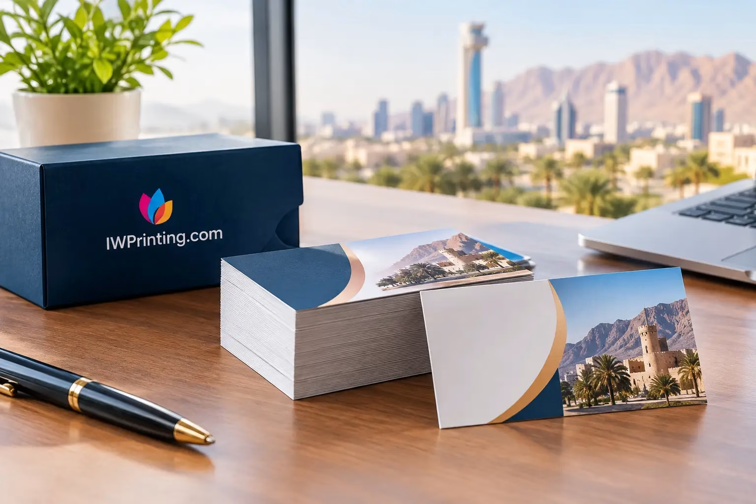
A business card is often handed over in the few seconds that follow an introduction, a site visit, or a promising conversation. That is why Business Card Printing in AlAin should be treated as a practical branding decision, not a last-minute office supply order. A card needs to look professional, feel right in the hand, and make it easy for someone to contact you after the conversation ends.
For local businesses, sales teams, consultants, retailers, property professionals, hospitality staff, and event exhibitors, a well-printed card continues working after the meeting is over. It gives your brand a physical presence when an email signature or social profile is no longer on screen.
The best business cards are clear before they are clever. A recipient should be able to find your name, company, role, phone number, email address, and website without searching through a crowded layout. If your business relies on walk-ins or local service calls, your address, service area, or QR code may also deserve space.
A card does not have to carry every detail about your company. In fact, trying to fit your full service list, social handles, slogan, map, and promotional offer onto a small format usually weakens the result. Let the card create recognition and give the recipient a direct next step. Your brochure, website, signage, and sales team can do the heavier explaining.
The physical quality matters too. Thin paper can make even a strong logo feel temporary. Poor trimming, dull colors, and low-resolution artwork suggest a lack of care, especially for businesses selling premium services. Good stock, sharp printing, and accurate finishing signal that your company pays attention to the details customers will notice.
Standard rectangular cards remain the most useful option for most businesses. They fit wallets, cardholders, reception desks, and event badge holders, and they are easy to reorder in volume. A horizontal layout is familiar and flexible, while a vertical card can stand out when the branding and content are simple enough to support it.
Choose a size based on how your card will be used. A standard business-card format is efficient for corporate teams and everyday networking. Square cards, folded cards, and custom die-cut shapes can create a stronger first impression, but they come with trade-offs. They may cost more, be harder to store, and leave less usable space for contact details. These formats work best when they support a clear brand purpose rather than being different for its own sake.
For example, a real estate agent may benefit from a standard card with a clean headshot, direct number, and QR code to listings. A restaurant opening might use a slightly heavier card with a voucher or reservation prompt on the reverse. A creative studio could use a textured finish or a non-standard format, provided readability remains strong.
Paper choice affects both how the card feels and how it performs. A practical matte card is a dependable choice for everyday networking because it looks professional, avoids excessive glare, and is easy to write on. This is useful for appointment notes, quick reminders, or personalized follow-ups.
Glossy cards make colors appear brighter and can suit retail, food, beauty, entertainment, and product-led brands. However, heavy gloss can create glare under office lights and may show fingerprints more easily. A soft-touch finish gives a premium, velvety feel that can work well for luxury services, executive profiles, and high-end hospitality, though it is usually better reserved for cards where tactile impact supports the brand position.
Thickness should match the purpose. Standard stock is cost-effective for large teams, campaigns, and frequent handouts. Thicker stock gives a more substantial feel and is often worthwhile for owner-led businesses, sales representatives, consultants, and brands where trust is built face to face. There is no universal best option. The right choice depends on the volume you need, the audience receiving the cards, and the impression your brand needs to make.
Strong business card design starts with hierarchy. Your name and company name should be immediately visible. Then come the most useful contact details, followed by supporting information such as a job title, service line, QR code, or social handle.
Avoid using too many typefaces, too many colors, or very small text. A card can look modern without becoming difficult to read. High contrast is particularly important: light text on a light background and dark text on a dark background may look stylish on a screen but often lose clarity when printed.
Use your logo in a size that is recognizable, but do not let it take over the entire card unless your brand is already widely known. White space is valuable. It gives the eye a place to rest and helps the most important details stand out.
A QR code can be useful when it has a specific destination. It might lead to a digital contact card, booking page, portfolio, menu, WhatsApp inquiry, or product catalog. Test it before printing the full quantity. A QR code that is too small, too close to the edge, or placed over a busy background can fail at the moment it is needed.
A good print file prevents delays, reprints, and disappointing results. Use high-resolution logo files and images. Artwork created for social media or copied from a website is not always suitable for print, especially if it is a small, compressed image.
Set the design to the correct final size and include bleed where required. Bleed is the extra artwork area beyond the trim line that allows background colors and images to run cleanly to the edge after cutting. Keep important text, logos, and phone numbers safely inside the trim area so they are not too close to the edge.
Color is another frequent issue. Screens use light to display color, while commercial printing uses ink or toner on physical stock. A bright screen color may print differently depending on the material and finish. Brand-critical colors deserve special attention, particularly for companies with established corporate identity guidelines.
If you do not have print-ready artwork, professional design support can save time and avoid common mistakes. IWPrinting.com can help businesses move from a basic logo or existing brand assets to a card layout that is practical to print and easy to reorder.
Ordering too few cards creates unnecessary repeat orders. Ordering far too many can be wasteful if team details, phone numbers, job titles, or branding are likely to change soon. The right quantity depends on how quickly your staff distribute cards and how stable the information is.
A business owner who attends weekly client meetings may need several hundred cards. A company preparing for an exhibition, recruitment drive, property launch, or sales campaign may need a larger quantity for multiple staff members. For new businesses still refining their brand, it can be smarter to start with a moderate run, confirm that the design performs well, and then reorder confidently.
For teams, keep layouts consistent while personalizing names, titles, direct numbers, and email addresses. This creates a unified company image without making every employee card feel generic. Save approved artwork and specifications for easy reordering, especially when onboarding new staff or replacing depleted stock.
Business cards are useful wherever a customer may need to reconnect with you. Add them to completed orders, product packaging, welcome packs, invoices, showroom bags, event handouts, and reception displays. Service businesses can leave them at partner locations or include them with quotations and site visit documents.
They also work better when they connect to your wider visual identity. The same logo, colors, typography, and message should appear across letterheads, envelopes, folders, stickers, packaging, signage, vehicle graphics, and exhibition materials. Consistency helps customers recognize your business faster, whether they meet you in Al Ain, see your vehicle on the road, or receive a delivery at their office.
Before approving a print order, check every phone number, email address, job title, and QR code one final time. Then choose materials and finishing that reflect the level of service you want customers to expect. A business card may be small, but when it is clear, well made, and easy to act on, it gives every introduction a better chance to become business.
Shopping bag Printing turns every purchase into brand exposure. Choose materials, sizes, finishes, and artwork that fit your product, budget, and customers.
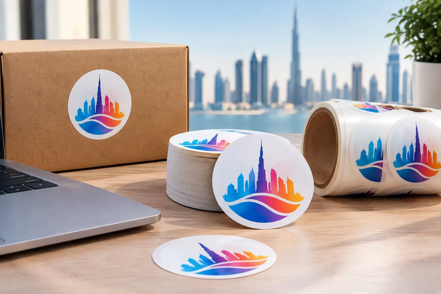
Get Round Sticker Printing in Dubai for product labels, events, and promotions. Choose durable materials, sharp color, custom sizes, and fast delivery.
WhatsApp us
Printing, corporate gifts and signage — tell us what you need and let AI help you find it.
Ask naturally. IWPrint AI can understand your product, quantity, budget and requirement.