
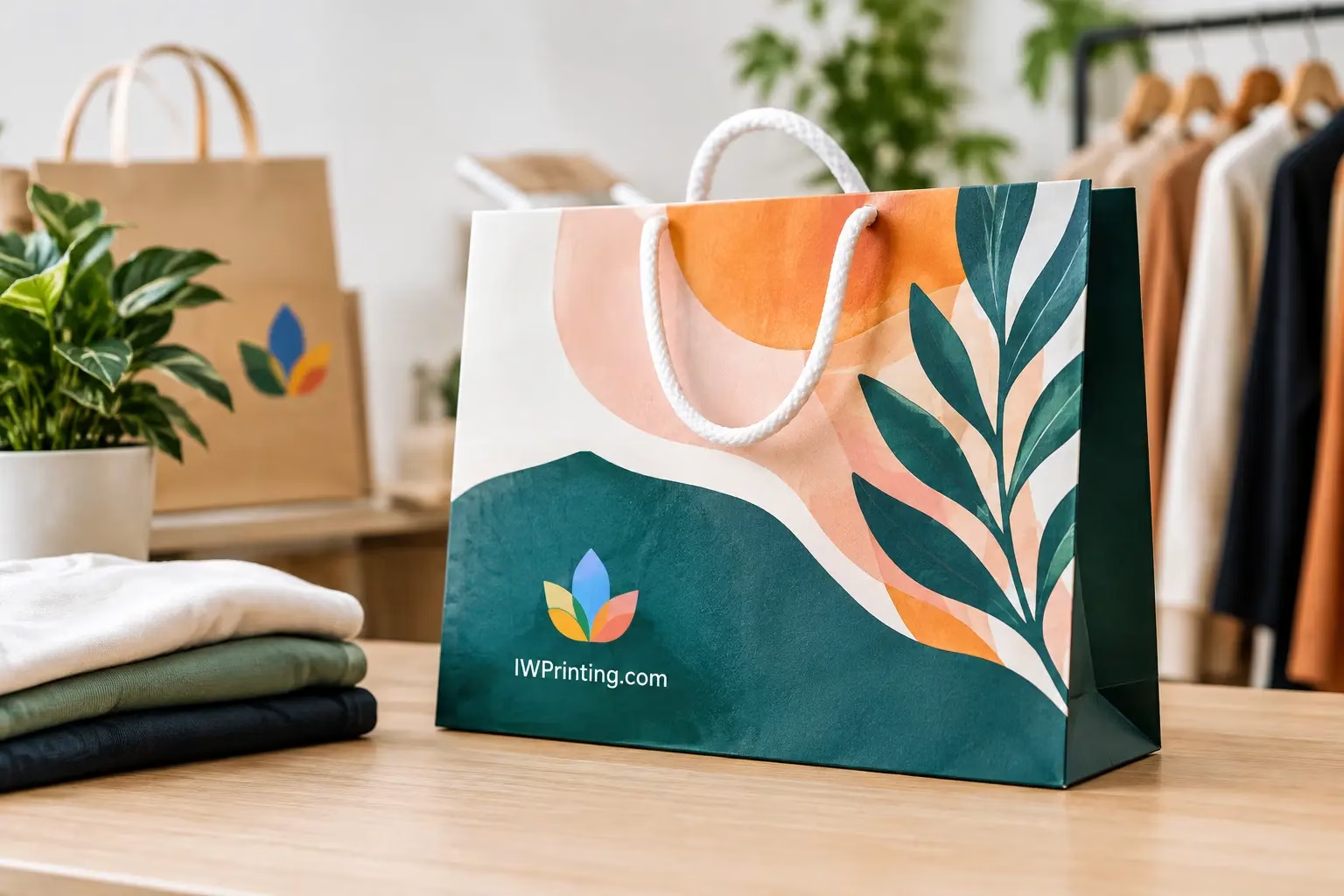
Shopping Bag Printing That Builds Brand Recall
Shopping bag Printing turns every purchase into brand exposure. Choose materials, sizes, finishes, and artwork that fit your product, budget, and customers.
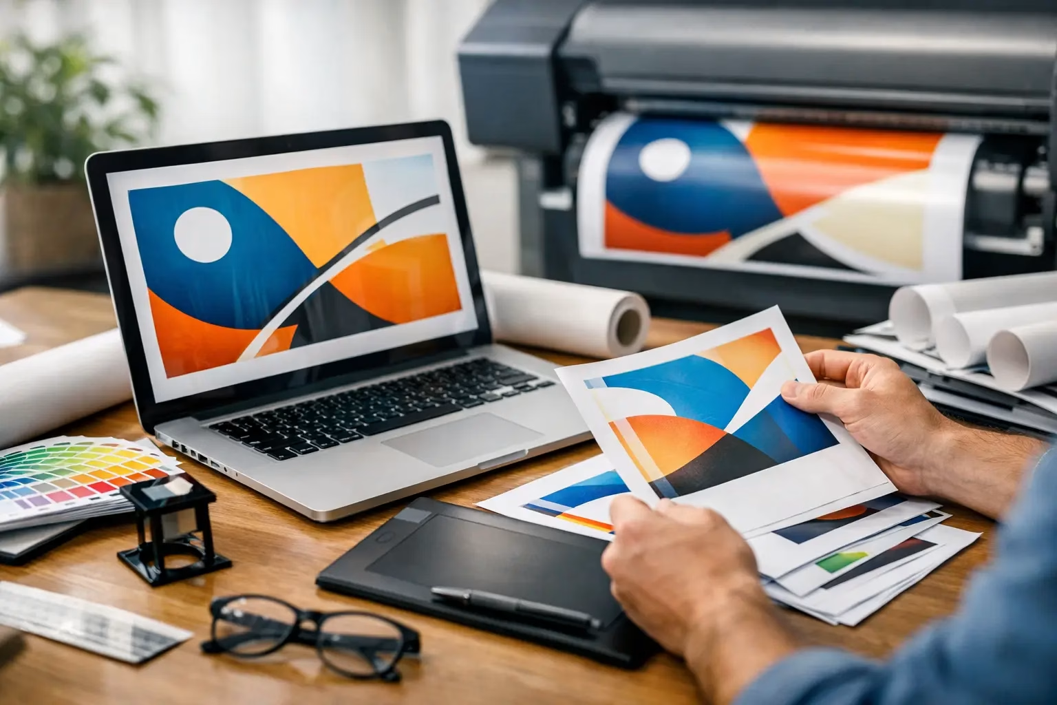
A storefront sign can be perfectly printed and still fail if the logo is too small to read from the road, a phone number sits behind a mounting bracket, or the artwork was supplied at the wrong scale. Knowing how to prepare signage artwork means designing for the real surface, viewing distance, production method, and installation – not just for a screen.
For business signs, event graphics, wall wraps, vehicle branding, and retail displays, a few checks before production can prevent reprints, delays, and avoidable costs. Start with the job specifications, then build the artwork around them.
Before opening a design file, define where the sign will be used and what it must achieve. A reception logo wall, a construction safety board, and an outdoor roadside billboard all require different artwork decisions. The same brand colors and logo may be used across each one, but the message, material, and readable text size should change.
Consider the viewing distance first. Signs read from several feet away need larger type and simpler messaging than graphics viewed at arm’s length. A window sticker can carry opening hours, a QR code, and product details. A building fascia sign may need only the business name, logo, and a short descriptor. Trying to fit brochure-level content onto a large sign often makes it less effective.
Placement also affects visibility. Check whether the sign will be viewed straight on or at an angle, during the day or at night, and from a moving vehicle or on foot. For illuminated letters and LED signage, ask for the visible face size, return depth, lighting direction, and any limits on colors or small details. Fine lines that look good in a digital mockup may not remain clear when fabricated or illuminated.
Always work from the approved finished dimensions, stated as width by height. Do not estimate the size from a wall photograph, previous artwork, or an online product image. If the sign is being installed in an existing space, a site measurement is often the safest option.
For large-format projects, artwork can be created at full size or at a proportional scale, such as 1:10. If working at scale, label the scale clearly in the file name and production notes. A 1:10 file for a 20-foot-wide wall graphic must not be mistaken for a 20-inch graphic.
Add the correct bleed when the design prints beyond the finished edge. Bleed gives the production team extra image area for trimming, wrapping, or alignment. The required amount depends on the product. A rigid board, vinyl banner, wall graphic, and vehicle wrap are handled differently, so confirm the requirement before finalizing the layout.
Keep important logos, text, QR codes, and contact information inside a safe area. This is especially important near edges, folds, hems, grommets, frames, and sign returns. On a banner, for example, text placed too close to the edge can be affected by hems or eyelets. On an acrylic panel, a key message may be blocked by stand-off hardware if mounting locations are not planned early.
Signage is not a place for small type, crowded layouts, or low-contrast color combinations. Give the main message room to stand out. In most cases, the viewer should understand the business name, offer, direction, or call to action within a few seconds.
Use a clear hierarchy: the logo or primary message first, supporting information second, and details last. Contrast matters as much as font size. Dark text on a dark photo, pale lettering on a bright window, or a thin font on a patterned background can disappear in real conditions.
If you include a QR code, use a high-quality vector version where possible and preserve a clear border around it. Test it at the intended printed size using a phone, not only on a desktop monitor. Reflective materials, textured walls, curved vehicle panels, and poor lighting can all affect scanning.
For bilingual signage, allow enough space for both languages instead of forcing one language into a smaller, less readable position. Confirm spelling, translations, phone numbers, social handles, and website addresses before approval. A small typo on a large exterior sign is expensive to correct.
Low-resolution images are one of the most common causes of soft or pixelated signage. Images taken from websites, screenshots, messaging apps, or social media are rarely suitable for large printing. Use original, high-resolution photography whenever possible.
Resolution should be judged at the final printed size. Close-view graphics, such as retail posters and exhibition panels, generally need sharper image detail than a billboard viewed from a distance. Large-format printing does not always require extremely high-resolution files, and oversized files can slow down production. The right setting depends on the product, viewing distance, and scale of the artwork.
Use vector artwork for logos, icons, text, line art, and cut shapes. Vector files remain sharp when enlarged, making them ideal for 3D letters, acrylic signs, vinyl-cut graphics, and large wall branding. Common vector formats include AI, EPS, SVG, and print-ready PDF.
Fonts can cause unexpected changes when a production file is opened on another system. Convert final text to outlines or curves, or supply the font files when requested. Keep an editable source file with live text for future updates, but send a separate production PDF with the final typography secured.
Color requires a practical approach. Screens display light using RGB, while print uses inks and materials that may produce a different result. Build print artwork in CMYK unless the production team requests another setup. If a precise brand color is essential, provide the approved Pantone reference and ask for a color proof or sample where the project justifies it.
Materials also influence color. The same artwork can look different on white acrylic, brushed metal, fabric, transparent vinyl, or a backlit film. Outdoor sunlight, indoor lighting, and LED illumination may further change how colors appear. For a brand-critical installation, a physical sample is more reliable than screen approval alone.
A clean final file helps the production team process the job quickly and accurately. PDF is usually the preferred format for print-ready signage artwork because it preserves layout, vectors, and fonts when exported correctly. High-resolution TIFF or JPEG files may work for image-only graphics, but they are less suitable when the design includes editable text, cut paths, or detailed vector logos.
Before exporting, remove unused elements outside the artwork area, hidden layers, old design versions, and low-resolution placeholder images. Check that linked images are embedded if the file will be shared independently. Flattening unnecessary transparency can also reduce the risk of unexpected output, although complex files may need a production team’s guidance.
For contour-cut stickers, vinyl lettering, shaped boards, or custom fabrication, create cut lines exactly as instructed. Cut paths should be clear, separate from the printed artwork, and named correctly. Do not use a visible stroke as a substitute for a production cut path. If the sign has drilled holes, folded edges, welded sections, or illumination components, provide a dimensioned layout or approved drawing alongside the visual artwork.
Use a file name that makes the job easy to identify. Include the client or project name, product, final size, revision number, and date. For example: `CafeVista_FasciaSign_600x120cm_Rev03.pdf`. Clear names reduce the chance of an old version being produced by mistake.
Artwork approval should include more than the front-facing design. Confirm the finished size, substrate, quantity, orientation, mounting method, and installation location. A sign may need to fit around electrical points, glass joints, doors, fire equipment, shelving, or architectural features that are not visible in the artwork file.
For wall graphics and vehicle branding, use an accurate template or measured site layout. Avoid placing important content across panel gaps, door handles, wheel arches, window seals, or uneven surfaces. For exterior signs, consider wind load, weather exposure, local property requirements, and whether the selected material is appropriate for long-term outdoor use.
A final proof should be reviewed at 100% for spelling and layout, then viewed at a reduced size to judge overall impact. Ask one practical question: if a customer sees this sign for three seconds, will they understand what to do next?
Before sending artwork to print, confirm these essentials:
Professional signage should make ordering, production, and installation easier – not create questions at each stage. If a specification is uncertain, share the artwork before final export and get production guidance. IWPrinting.com can help turn an approved concept into a sign that is clear, correctly built, and ready to perform where customers will see it.
Shopping bag Printing turns every purchase into brand exposure. Choose materials, sizes, finishes, and artwork that fit your product, budget, and customers.
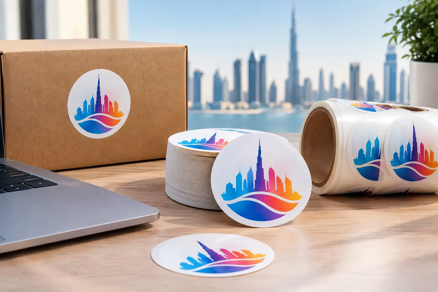
Get Round Sticker Printing in Dubai for product labels, events, and promotions. Choose durable materials, sharp color, custom sizes, and fast delivery.
WhatsApp us
Printing, corporate gifts and signage — tell us what you need and let AI help you find it.
Ask naturally. IWPrint AI can understand your product, quantity, budget and requirement.